I will be experimenting with using Dreamweaver which is an Adobe web production software to help me create a working website using a mixture of CSS and html. I will be creating a website with working links and transitions that will be used to promote my fine-art Photography, this ill be viewable on both web and mobile devices.
I begin by having my optimised images saved in to a folder titled “Millie’s folder’, please follow my previous blog post on how to optimise images for the web.
Each image on your website has to be cropped and saved as a seperate image, for example the navigation bar, logo, photographs, header graphic, background image and footer. This is because each of these parts of the website will be interactive in different ways. The background image we name ‘index’ followed by hyphens in place of spaces between words followed by any other div tags we want in to add to the image. For example index-fineartphotographer-milliesammarco. These div tags allow us to put text into the coding of an image that allows search engines recognise these keywords when placing you in the list of websites on their page, this is search engine optimisation.
By designing my Portfolio website on Photoshop I was able to make sure that the sizes, colours and proportions of the images were what I wanted and compatable for a standard computer monitor before optimising for use on a mobile phone/ tablet. Please see the example below o fthe design of my homepage titled “index” on Photoshop.

By cropping and saving each part of the mockup page as a jpeg or Png for the transparent objects I was able to place each image in to an image folder which was then in a folder called “Millies site”
When opening Dreamweaver I select Site from the navigation bar and then New site, I then select the Millie’s site folder from my hardrive, Dreamweaver then loads the file names in to the sidebar. Although you can select templates to allow easy placement of objects such as text and images I found that by choosing a blank template I had more freedom to design my template from scratch.
I selected the split screen option which gives you the html code on the left hand side of the screen and the preview of the page on the right. Please see below

As you can see from the code of my main page I have hand coded HTML in the text to create a Heading and a subheading. Please refer to Previous blog post on how to handcode H1, H2
<h1>Fine Art photography by Millie Sammarco</h1>
<h1> </h1>
<h1>Brighton and London based Fine Art and Documentary Photographer
<h2></p>
I have a ‘container’ which acts as the wrapped holding the content of my website within set parameters. I then have a Header which contains my logo and Navigation bar
<div class=”container”>
<div class=”header”>
<div align=”center”><!– end .header –><img src=”logo.png” width=”139″ height=”121″ alt=”fineart-fine-art-foneartphotography-photography-brightonphotographer-milliesammarco-photographermilliesammarco” /><img src=”logo-dancingshrimp-photography-fineart-milliesammarco.png” width=”746″ height=”101″ /></div>
</div>
<div id=”nav”>
<ul>
<li><a href=”index.html”>Home</a></li>
<li><a href=”about.html”>About</a>
<li><a href=”Gallery-other.html”>Gallery</a>
<ul>
<li><a href=”Gallery-still-life.html”>Still life</a></li>
<li><a href=”Gallery-identity.html”>Identity</a></li>
<li><a href=”Gallery-other.html”>Other</a></li>
</ul>
</li>
<li><a href=”Contact.html”>Contact</a></li>
</ul>
</div>
<div id=”navbar”>
To maintain the continuity of my website and to make sure everything links well I made sure the heights and widths were the same on each object placed on each of the web pages.
To create my navigation bar this is the html I used.
<ul>
<li><a href=”index.html”>Home</a></li>
<li><a href=”about.html”>About</a>
<li><a href=”Gallery-other.html”>Gallery</a>
<ul>
<li><a href=”Gallery-still-life.html”>Still life</a></li>
<li><a href=”Gallery-identity.html”>Identity</a></li>
<li><a href=”Gallery-other.html”>Other</a></li>
</ul>
</li>
<li><a href=”Contact.html”>Contact</a></li>
</ul>
In my Contact me page I used html to set the widths and heights by inserting colums and rows to create an invisible table. This allowed me to create a for in where people can email me. Currently there is no html so that it links to my email address as my web hosting will provides me with this included in the package. This is the html for my Contact form.
<p> </p>
<form name=”htmlform” method=”post” action=”html_form_send.php”>
<div align=”center”>
<table width=”644″ height=”430″>
</tr>
<tr>
<td valign=”top”>
<label for=”first_name”>First Name </label></td>
<td valign=”top”>
<input type=”text” name=”first_name” maxlength=”50″ size=”30″>
</td>
</tr>
<tr>
<td valign=”top””>
<label for=”last_name”>Last Name </label>
</td>
<td valign=”top”>
<input type=”text” name=”last_name” maxlength=”50″ size=”30″>
</td>
</tr>
<tr>
<td valign=”top”>
<label for=”email”>Email Address </label>
</td>
<td valign=”top”>
<input type=”text” name=”email” maxlength=”80″ size=”30″>
</td>
</tr>
<tr>
<td valign=”top”>
<label for=”telephone”>Telephone Number</label>
</td>
<td valign=”top”>
<input type=”text” name=”telephone” maxlength=”50″ size=”30″>
</td>
</tr>
<tr>
<td valign=”top”>
<label for=”comments”>Comments </label>
</td>
<td valign=”top”>
<textarea name=”comments” maxlength=”1500″ cols=”50″ rows=”15″></textarea>
</td>
</tr>
<tr>
<td height=”34″ colspan=”2″ style=”text-align:center”>
<p align=”center”> </p>
<p align=”center”>
<input type=”submit” value=”Submit”>
</p></td>
</tr>
</table>
</div>
</form>
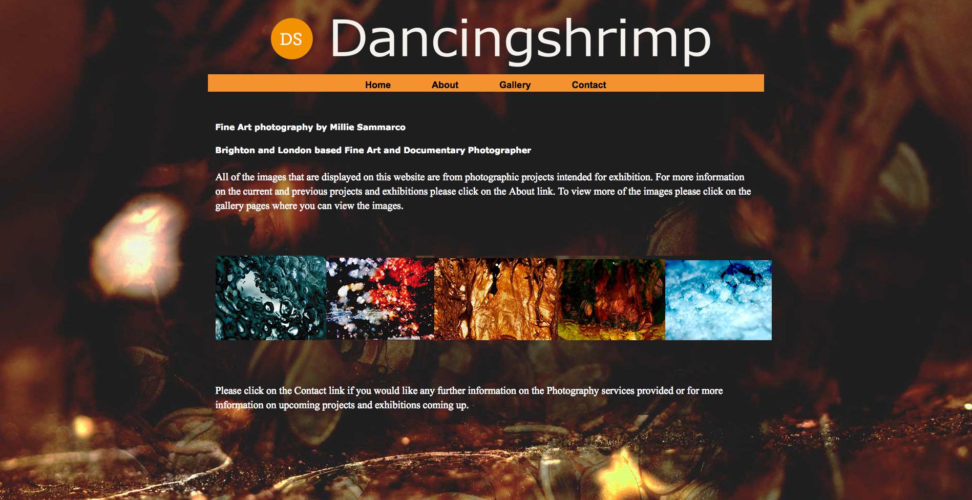
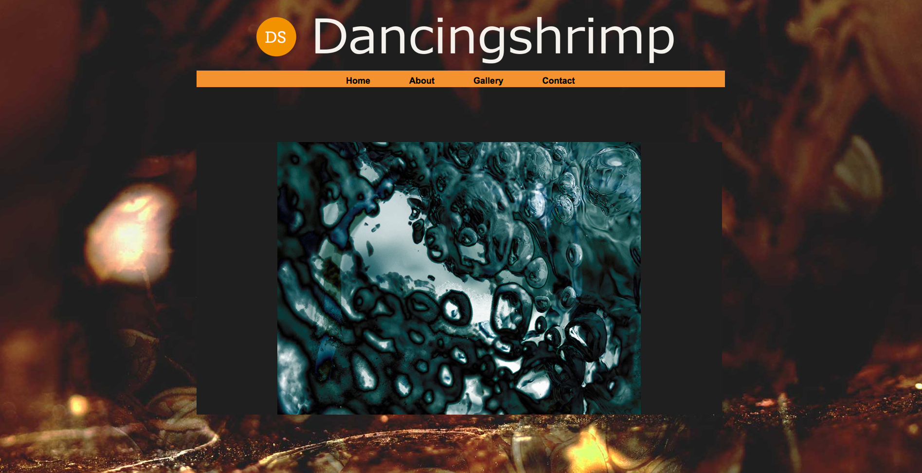
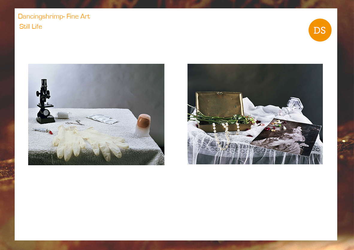
The final pages on my website look like this.
My about page

My Homepage

My Contact me page

My gallery pages


 milliesammarco